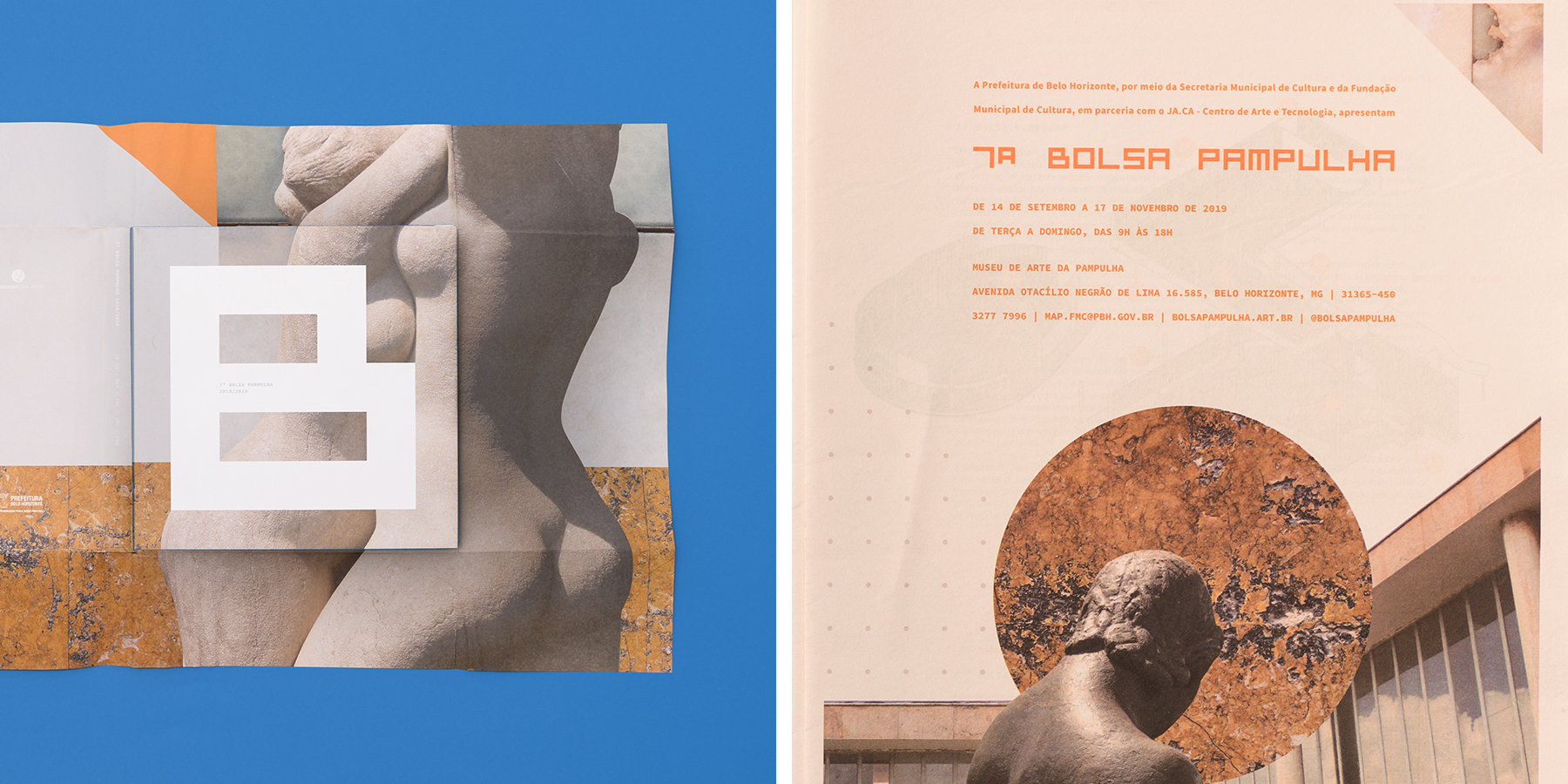
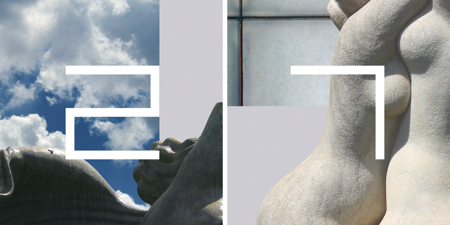
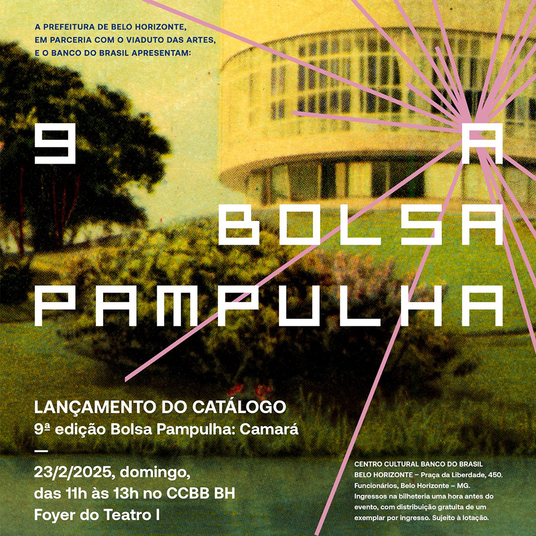
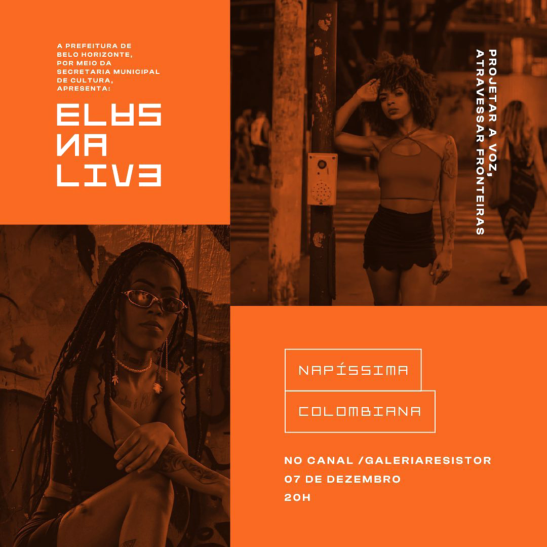
Developed for the visual identity of the 7th edition of Bolsa Pampuha, MAP was inspired by the lettering on Muse de Arte da Pampulha’s façade. Designed over a square grid, the font reinforces the rigid geometry typical of modernist architecture. On the event’s identity, MAP was used alongside curvilinear elements, typical of Niemeyers take on modernism, such as the Pampulha lake and statues of human figures. The font worked so well on the identity that the Museum decided to adopt it as the institutional font for the program, using it in all its further editions.
Read more about the development of the project (in Portuguese) ↗
MAP / In display 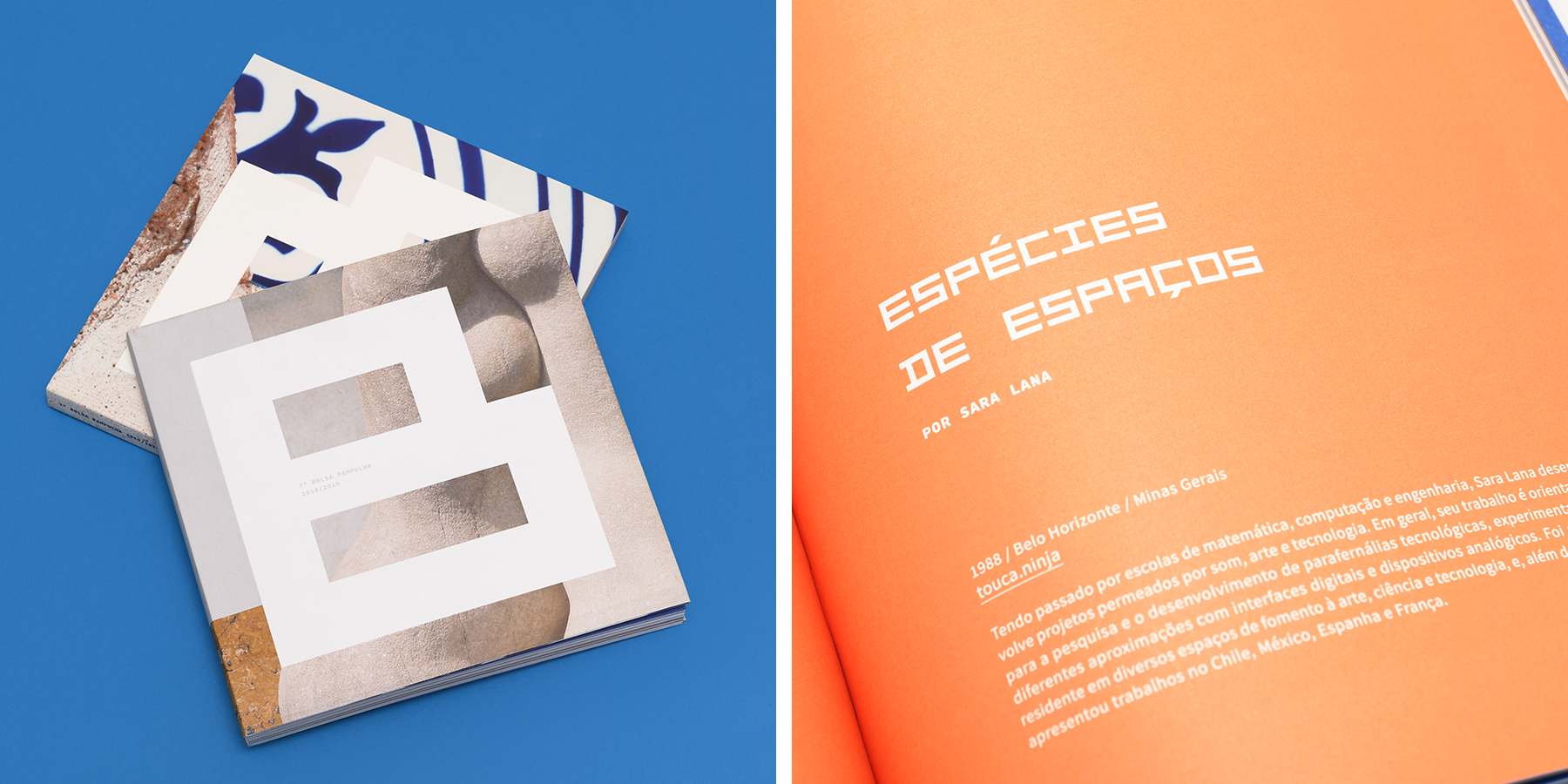
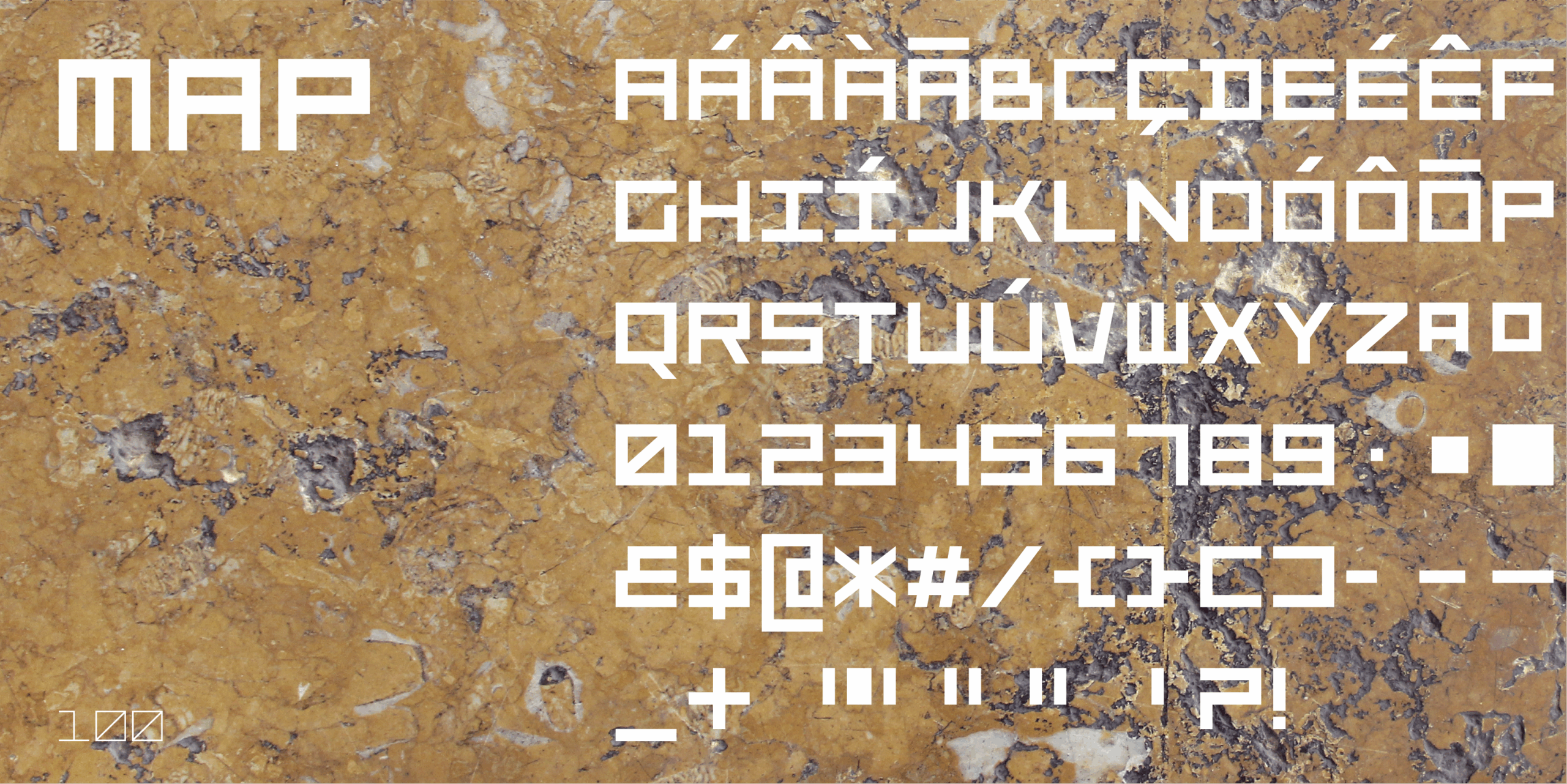
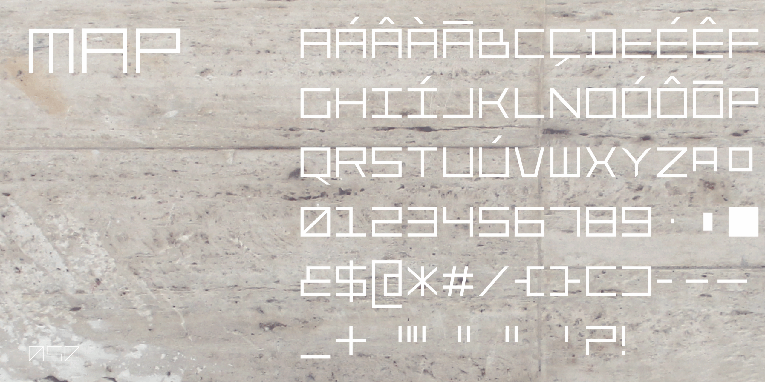
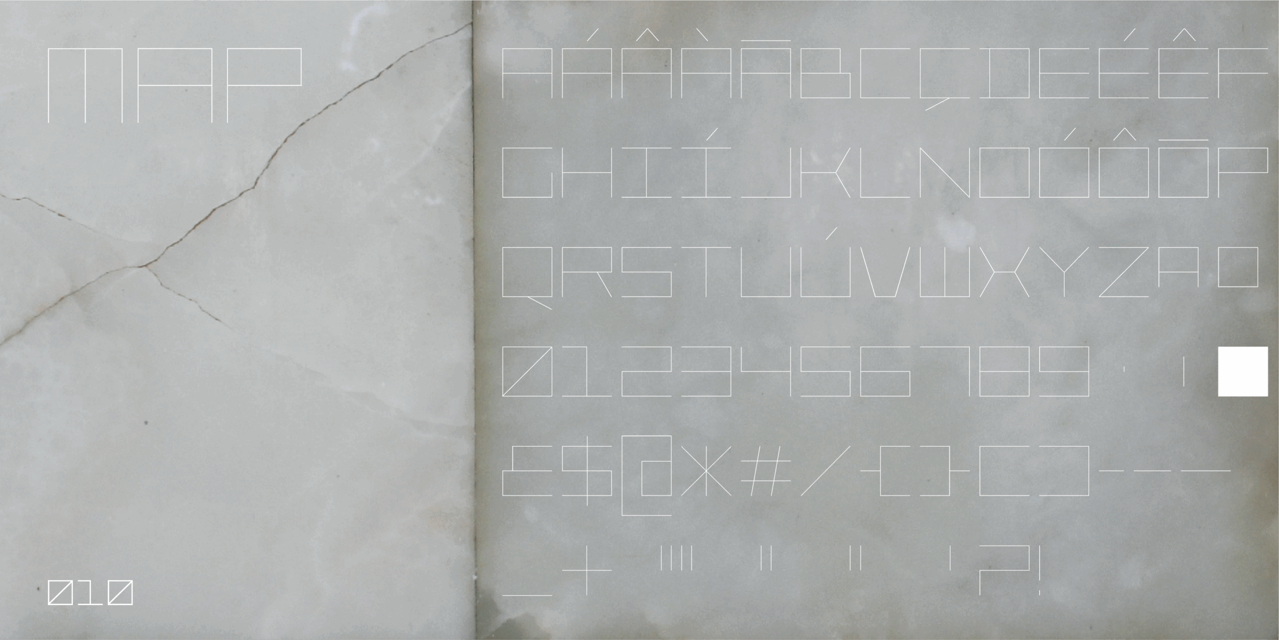
MAP
—- 10 fonts / 10 weights
- 197 glyphs / covers most romance languages
- suitable adjectives / modernist, geometric, monolinear, monotonic, square, blocky, sober,